“I have been asked from a lot of developers “What is responsive design all about? How does it work, and how do I do it?” In this article I’m going to try to explain responsive design and how that relates to media queries.”
Implementing responsive design has become a major goal for most organizations over the fast few years. Every company wants or has a responsive website, users consider it a must have considering increasingly they expect websites to support multiple devices. The problem we are actually trying to solve is how to keep up with all of these different resolutions and devices. Can we really design it for every single one of them? Do we design and develop specifically for each device?
Some people might have heard of adaptive design, and it is important to differentiate between responsive and adaptive. Adaptive design occurs on the server-side when the application code recognizes the device you are using and changes the website content appropriately. Responsive design works entirely on the front-end; the UI responds to the resolution of the current device.
Media Queries
When talking about responsive design, we need to mention Media queries. Media queries are a CSS technique introduced in CSS3. It uses the @media rule to include a block of CSS properties when a certain condition is true.


Key Break Points
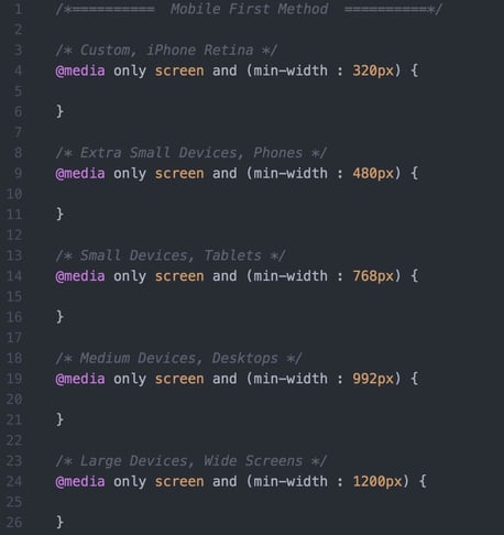
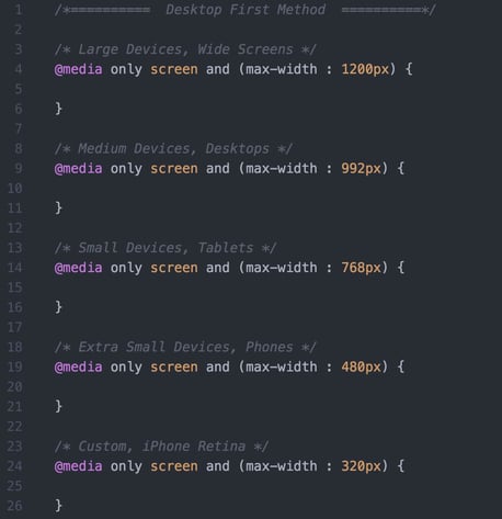
When we talk about responsive design we need to discuss break points. A break point is the size at which a layout is changed so the user has the best possible viewing experience. Common break points are:
- Modern desktop resolutions: 1200px and above
- Older desktop and tablet resolutions: 992px and 768px
- Mobile resolutions: less than 768px (768px, 480px and 320px)
Mobile-first and Desktop-first approaches with Media Queries
A Mobile-first approach to styling means that styles are applied mobile devices first, and then later on overridden with media queries for larger resolutions, and vice versa. Mobile-first approach uses min-width condition, while desktop-first uses max-width condition.
Learn more about modernized technology here:
Interested in training to help advance your agile journey? Click the button to view our current list of public training courses! Use code BLOG10 for 10% off!

